Rebranding POLITICO
Unifying POLITICO US and POLITICO Europe into one global brand: a new logo, one red, and a single typography family. Led with Want Branding.
The problem
By 2024, POLITICO had grown into two brands wearing the same name. The US and Europe ran different logos, four different reds across style guides and web, and two entirely separate typography families: DIN, Georgia, Tungsten and Jubilat on one side; Publico, Crimson Pro, Roboto and Gotham on the other. Consistency had become impossible, and every product paid for it. After Axel Springer bought POLITICO and brought in one CEO, it was time to bring things together.
The work
Working with Want Branding, the brief was "One POLITICO: creating a unified world class brand". Three moves: rationalise the design system into shared practice, resolve the differences between US and EU, and modernise the core identity to be more effective and competitive.
A new logo
Rather than pick the US or the EU logo, we recommended a new one: a decision that de-politicised the choice and fixed the inherent design flaws in both.
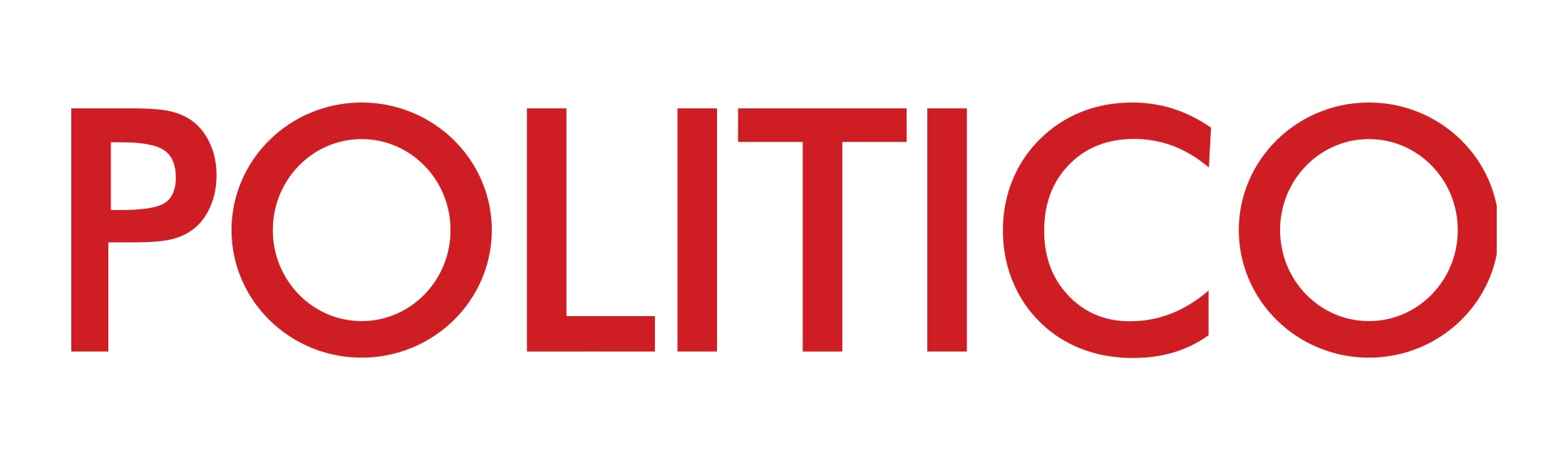
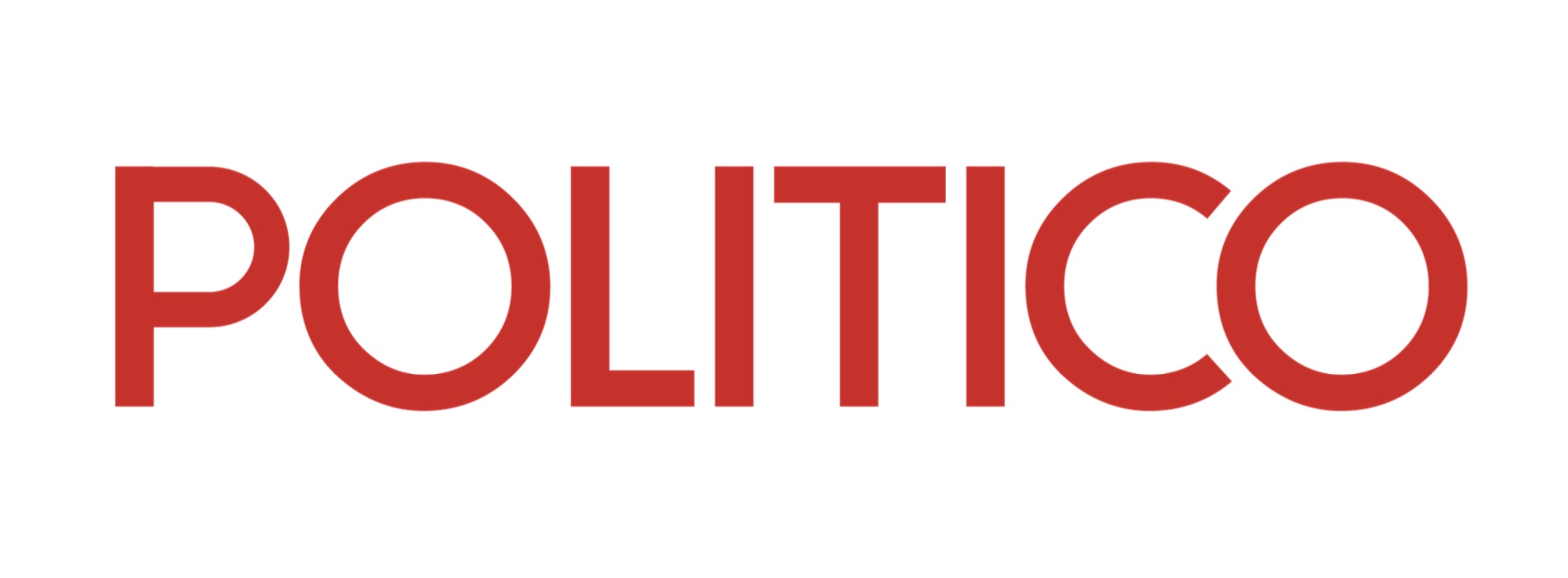
The POLITICO logotype, refined and defining in the realms of politics, influence, and authority, boasts beautifully spaced letters with a discerning connection between the "C" and "O". This logotype lies at the heart of our opinion and communications. Always capitalize "POLITICO" when referencing "POLITICO" in any written or visual communication. It is essential to always use approved digital artwork when producing materials. Never attempt to redraw the POLITICO logotype.
One red
Four reds became one: a shade with a blend of vibrancy and richness that lets the logo stand out without being too bright or too dark. Bold, commanding, classic, and optimised for both web and print.




One red replaced all four:

New typography
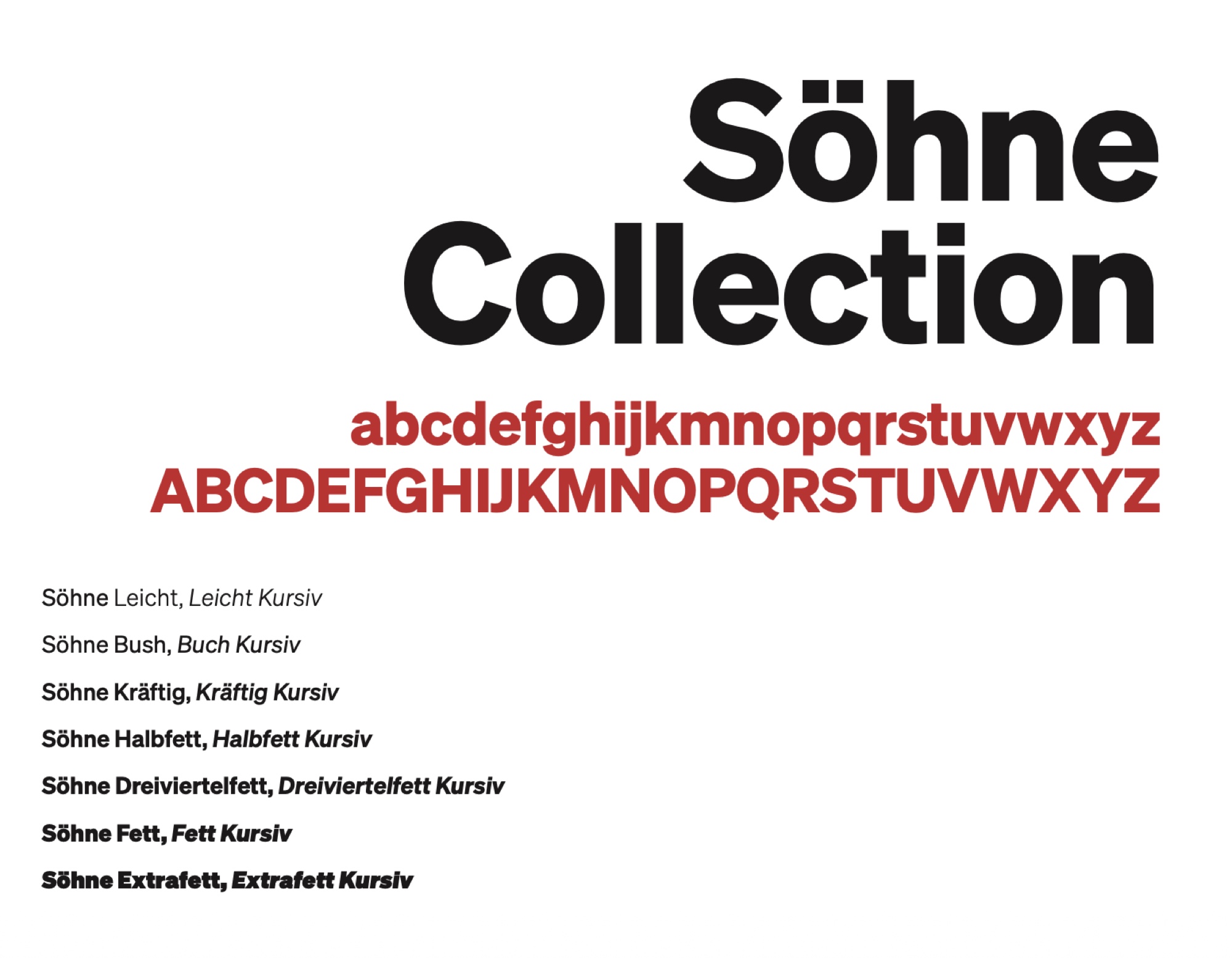
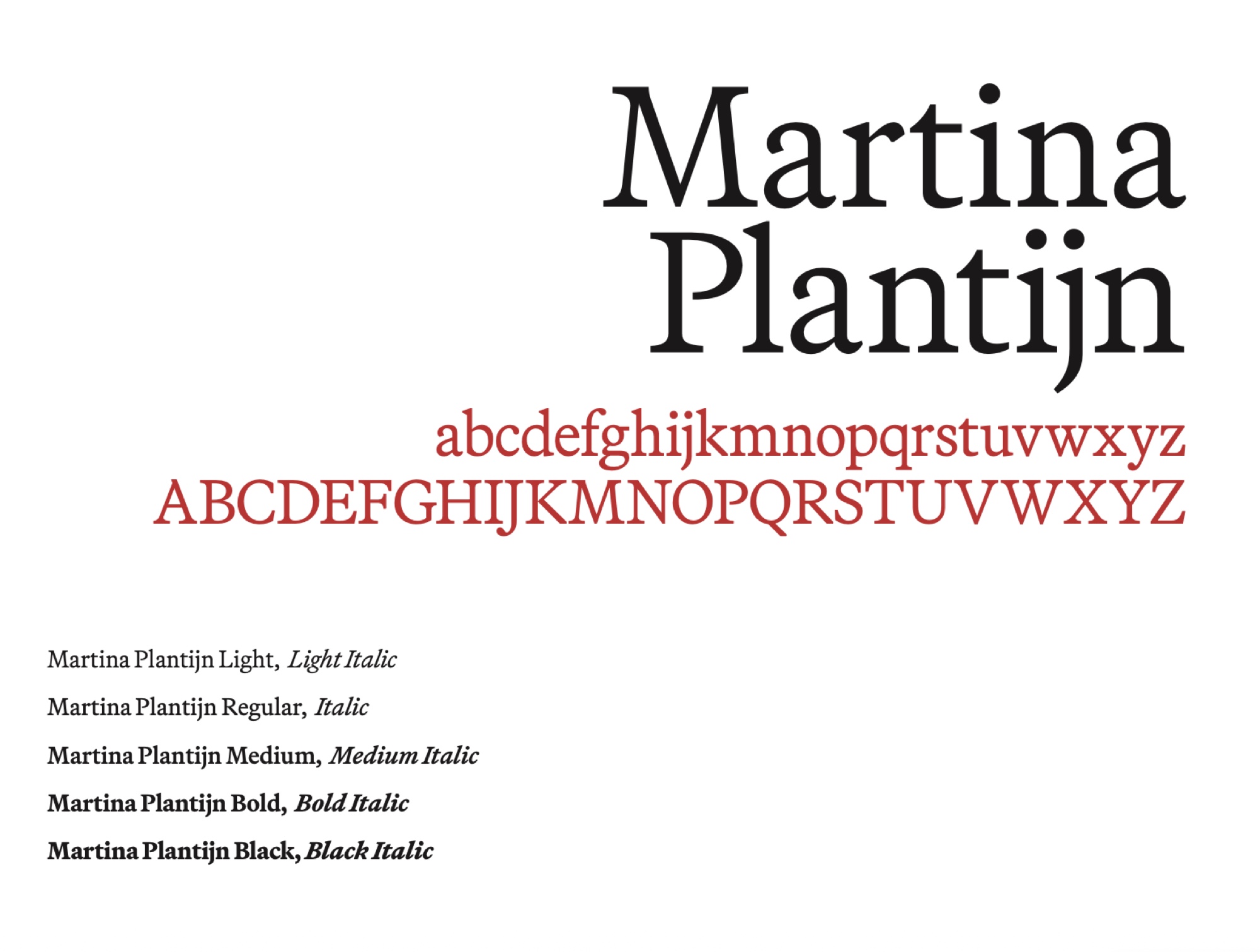
We replaced two sprawling font families with one pairing. The titling face is Söhne; the body face is Martina Plantijn. Together they gave the newsroom better readability and legibility, and gave internal teams the range they needed for a genuinely extensive product portfolio.
Into the guidelines
The result is a single brand style guide covering narrative, visual style, sub-brands and corporate applications: the governance layer that keeps one POLITICO consistent everywhere it shows up.
Gallery