Euractiv rebrand
Leading the metamorphosis of one of Europe's leading policy media networks - identity, products and place - across 12 languages and 12 capitals.
The brief
EURACTIV had spent years making EU policy legible. But a survey of readers, partners and clients came back with a blunt verdict: the brand needed a metamorphosis. Over six months we rebuilt it - identity, products and place.
My role
I led the rebrand: the brand strategy and narrative, the identity system developed with our designers, the product changes that came with it, and the rollout across 12 languages and 12 capitals. The Brief was my product call - the daily habit the rebrand needed to prove itself.
A new daily habit
On the product side, the centrepiece was The Brief - a straight-talking, bite-sized and genuinely fun wrap-up of the day's news, launched in September 2016. It quickly became an afternoon fixture in 50,000+ inboxes, praised for its analysis and style by laymen and prime ministers alike.
Closer to client needs
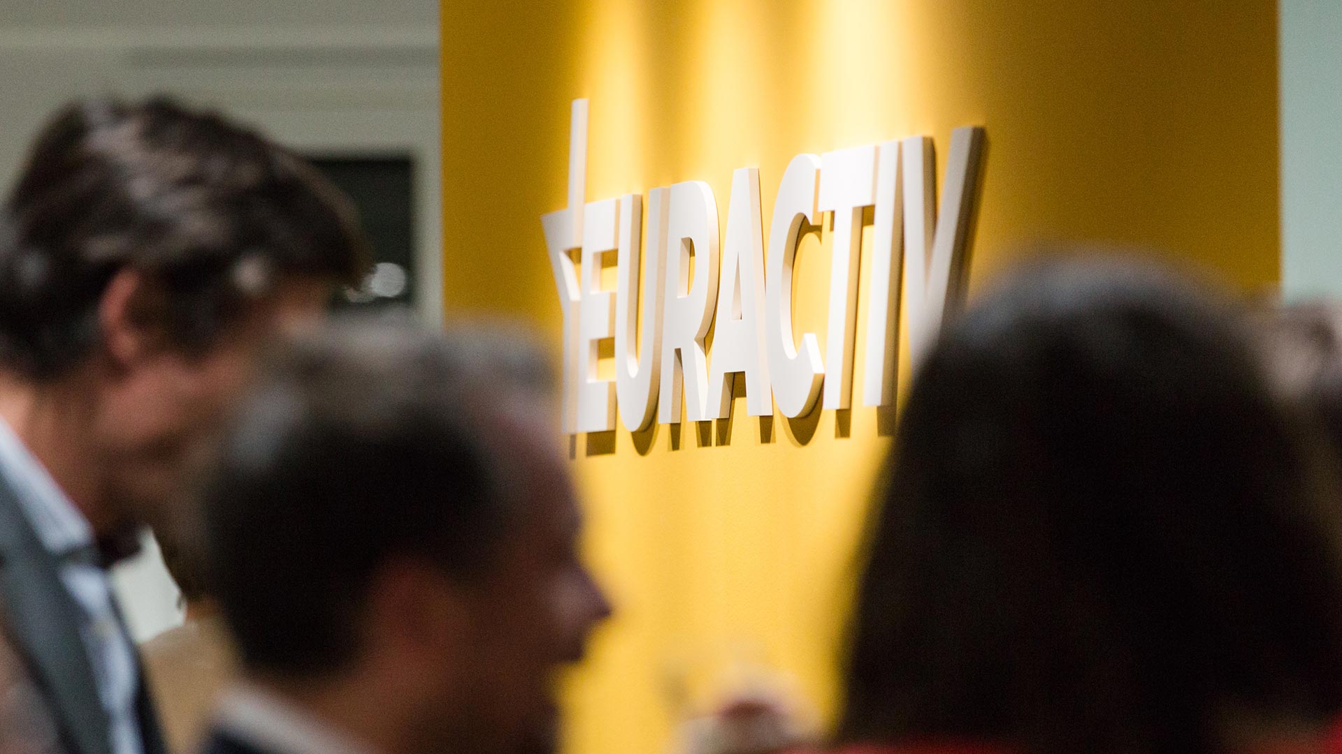
We rolled out clearer, more flexible products: supporters could now align with specific Policy Topics rather than broad sections, raising awareness more efficiently - with editorial work kept firmly independent. A new Brussels office gave us a bigger video studio and events venue.
The narrative behind the logo
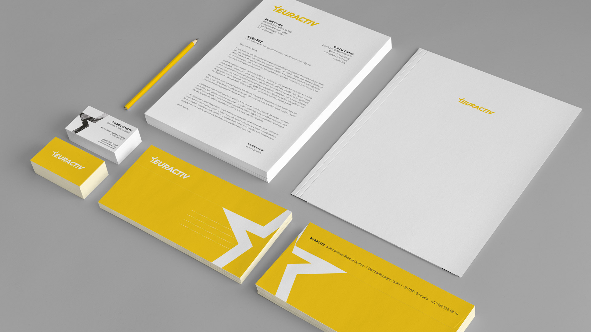
People love to call EU policy boring. We beg to differ - and the new identity had to argue the point. EURACTIV was born European; pro-European, not pro-institution. When the institutions get it wrong, we say so. That conviction is what the new logo had to carry.
True to the core
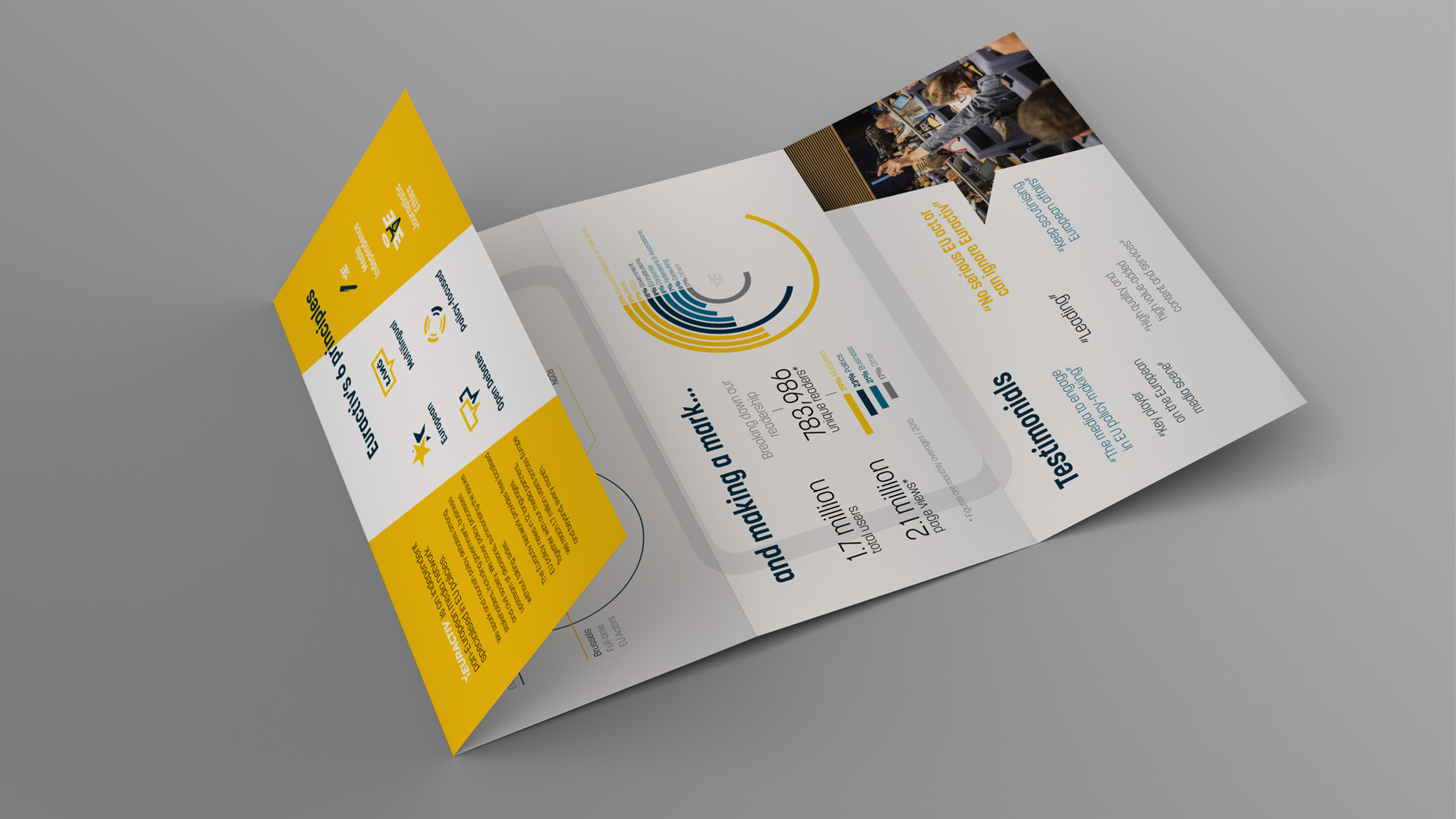
Four values anchored the system: multilingual reporting across 12 languages and 12 capitals; transparency among EU actors; efficiency that saves readers - and the process - time; and fiercely guarded media independence.
Colours & shapes: modern, and still yellow
Yellow has defined EURACTIV since launch, so it stayed - warmed up, easier on the eye, conveying warm relations with “EU Actors”. White became the main supporting colour, standing for transparency and independence. Black carries text; navy blue handles more complex designs. The Star Bubble fuses the EU flag's star with a speech bubble, built on a 72° inclined line that runs through the entire brand.
The result
A cleaner, more elegant, more modern EURACTIV - reaching 1.7 million users a month directly and via media partners, across 12 languages from 12 capitals. The same Yellow Team, sharper than ever.
Gallery