Assembly of European Regions rebrand
Modernising the identity of Europe's largest independent network of regions - and rolling it out across print and digital for member regions in 30+ countries.
The brief
The Assembly of European Regions is the largest independent network of regions in wider Europe - a political network built on cooperation between regions and their citizens. By 2017 its identity had fallen behind the organisation: a dated logo, inconsistent colours, and assets that varied from team to team and region to region.
My role
I led this and did it myself: the identity, the rollout across the network, the annual report and the State of Regionalisation study. The only outside help was Habile Studio in Paris on the activity report.
The identity
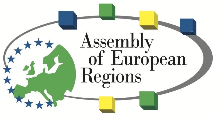
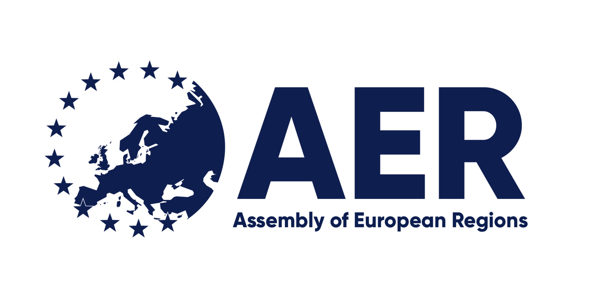
I took the brand from its heavy legacy mark to a cleaner, more confident one: a modernised typeface, better balance in the Europe map at the heart of the emblem, and a unified colour palette designed for ease of use - so every team and member region could apply it correctly without a designer in the room.
The rollout
The new identity rolled out across printed and digital assets for a network spanning 30+ countries: committee plenaries and events from Romania to Nancy, the Youth Regional Network, campaign launches like the #CohesionAlliance, and the organisation's day-to-day communications.
A new kind of annual report
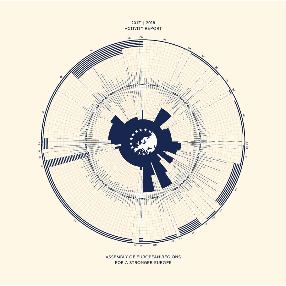
With the Paris-based design agency Habile Studio, I pioneered a new type of activity report for the organisation. The 2017–18 edition opens with a circular data visualisation of every member region - population, country population and GDP orbiting the star emblem - in a restrained navy-on-cream palette that made an institutional document feel like a designed object.
The State of Regionalisation
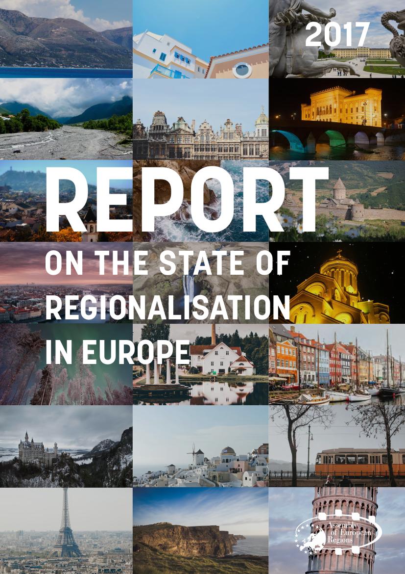
I also designed the 2017 Report on the State of Regionalisation in Europe - a major research publication given a photographic mosaic cover celebrating the diversity of Europe's regions, from Nyhavn to Neuschwanstein.
Gallery